Web Directions Hover ’22 session spotlight–Ditch the Media Queries: Modern CSS Replacements for Better Responsive Code
Ditch the Media Queries: Modern CSS Replacements for Better Responsive Code
Thankfully, CSS has come a long way since the days when device-based breakpoints were the norm, but a lot of us got used to just throwing in a media query (or twelve) to make things responsive, and never quite broke the habit. Now that we have modern CSS features like grid, flexbox, calc, clamp, aspect-ratio, and more – in 2022, it’s finally time to ditch the media queries in your responsive code. Today, we’re going to start at the top and work our way down: from the big-picture display formatting all the way to the smallest CSS units. And as for your old stylesheets, don’t worry too much…we can refactor. We have the technology
About Kathryn Grayson Nanz
Kathryn Grayson Nanz is a Developer Advocate at Progress with a passion for React, UI design, and sharing with the community. She started her career as a graphic designer and was told by her Creative Director to never let anyone find out she could code because she’d be stuck doing it forever; she ignored his warning and has never been happier. You can find her writing, blogging, streaming, and tweeting about React, design, UI, and more @kathryngrayson on Twitter.

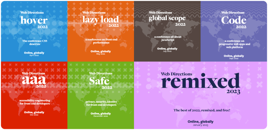
In 2022 we have a whole series of events for Front End Developers
Across 2022 Web Directions is presenting our series of online conferences for front end designers and developers. Focussed deep dives, they go far beyond what you might expect from conference programs.
Priced individually from $195, or attend all 6, plus get access to our conference presentation platform Conffab for just $595, or $59 a month.
Great reading, every weekend.
We round up the best writing about the web and send it your way each Friday.

