Container queries are (almost) here, finally
With Hover, our CSS focussed conference debuting on Friday April 23rd, this week I thought I’d focus on one of the sessions at Hover, or more specifically one of the technologies we’ll focus on, that’s just about ready for prime time, and which developers have been asking for for quite some time–container queries (initially referred to as ‘element queries’). Here’s a potted history of how we got here, and a look at some resources to help you get up to speed now they’re (almost) ready for primetime.
When Ethan Marcotte gave a name and unified approach to something web designers and developers had been stumbling toward for years, Responsive Design, the Web in many ways entered its modern phase.
By being able to tailor the presentation of a page based on media queries, typically the width of the page, we could now present a different layout, different font sizes, different images depending on the characteristics of he device the user was viewing the content on.
But there was still a piece of the puzzle missing. While it was nice to be able to adapt the design of an element to the overall page characteristics, such as its width, it would be great if the design of part of a page responded to its containers width (or other characteristics).
Back in late 2019 Zach Leatherman went looking for the earliest mention of container (or element) queries. The earliest reference he found was Andy Hume’s JavaScript based solution for “Selector queries and responsive containers“.
In 2015, Mat Marquis, hot off the success of the Responsive Images Community Group in developing and evangelising the adoption of the picture element, which brought images into the responsive age outlined the challenges with element queries and the case for container queries.
Then in 2017, Ethan Marcotte wrote on the issue, and made the observation that in the years since his original piece on responsive design the work web designers and developers increasingly do focusses on patterns and components, rather than whole pages, making media queries less than ideal.
Since then, while many advocated for them, container queries still somewhat languished. So what was the issue? David Baron captured it succinctly in Thoughts on an implementable path forward for Container Queries
[container queries require] that styles depend on the size of the component, yet given how CSS works, the styles in a component influence its size. Arbitrarily breaking this loop would both give weird results and would interfere with browser optimizations related to incremental relayout
Thoughts on an implementable path forward for Container Queries
David then sketched out a strategy that would avoid this dilemma, which Miriam Suzanne built upon in her proposal.
This proposal builds on David Baron’s
Container Query Proposal & Explainer@containerapproach, which works by applying size & layout containment to the queried elements. Any element with both size & layout containment can be queried using a new@containerrule, with similar syntax to existing media-queries. Currently, size containment is all-or-nothing. In order to make that less restrictive for authors, I’m also proposinginline-size&block-sizevalues for thecontainproperty.
It’s this proposal that has been adopted by the W3C’s CSS Working Group, and now Chrome has started to implement container queries behind a feature flag.
So, we’re not quite there yet, but it’s now definitely coming.
Phew, quite a journey. So, how to get up to speed?
Stuart Robson has gathered together a few recent articles, including this just published piece by Hover speaker Ahmad Shadeed, and you can hear Miriam Suzanne herself speak on container queries at Hover.
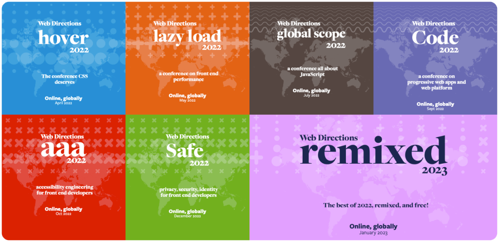
In 2022 we have a whole series of events for Front End Developers
Across 2022 Web Directions is presenting our series of online conferences for front end designers and developers. Focussed deep dives, they go far beyond what you might expect from conference programs.
Priced individually from $195, or attend all 6, plus get access to our conference presentation platform Conffab for just $595, or $59 a month.
Great reading, every weekend.
We round up the best writing about the web and send it your way each Friday.


